How to learn from Apple's mistakes on website accessibility
Joe Chidzik | 14 Sep 2018We often post about how good Apple is on accessibility, but a legal complaint against the company by a screenreader user last month has shown that even the biggest tech giants can fall foul of accessibility regulations and guidelines sometimes. Smaller organisations are often not considering web accessibility at all, meaning they could be discriminating against disabled people without realising.

According to the complaint against Apple, the company's website misses out some descriptions of images for screenreader users and presents confusing and unclear links about store locations and hours. These problems can make using a website frustrating and difficult for a blind person.
The AbilityNet accessibility team looked at the case last month and then ran through the Apple.com website to check out the issues. It revealed some simple, easily fixable problems which I've mentioned below. They found that although there were no issues here which completely prevented reaching the final stage of buying an iPhone, there are a number of challenges with the flow that will cause some users difficulties such as:
- Dynamic progression through shopping process
- Unclear method for returning to previous steps
- Insufficiently labelled radio buttons
Check out their detailed analysis for an expert insight on how to address accessibility issues. And feel free to use the code and ideas to make changes to your own website to provide a more inclusive digital experience.
Investigating Apple website accessibility issues
First we looked at difficulties accessing store locations and hours.
One of the issues noted within the complaint was that screenreader users had difficulty finding store information e.g. location and opening times. So we ran through the user-journey for finding a store, using the JAWS screenreader as this is one of the more popular screenreaders available - and is specifically mentioned in the case.
There were multiple difficulties noted. The key issues were:
- Insufficiently labelled input fields (meaning screenreaders are left unsure of what information is needed in the boxes they're asked to enter information into)
- Links with identical text, that lead to different locations. While this is not a failure of WCAG (Web Content Accessibility Guidelines), it is not good practise.
- Dynamic content not made accessible to screenreader users, e.g. auto-suggest search results
Further difficulties noted in the complaint were:
- Unable to browse and purchase electronics such as the iPhone, iPad, and MacBook Pro laptop
- Inability to make service appointments online
- Trouble finding a store
Finding a store
We found that navigating to the 'Find a store' page was relatively simple. From the homepage, using a JAWS screenreader, the user presses H until 'Apple Store' heading is selected. Then they tab to the 'Find a store' link, which leads to the find a store page. The form on this page is presented as the image below.
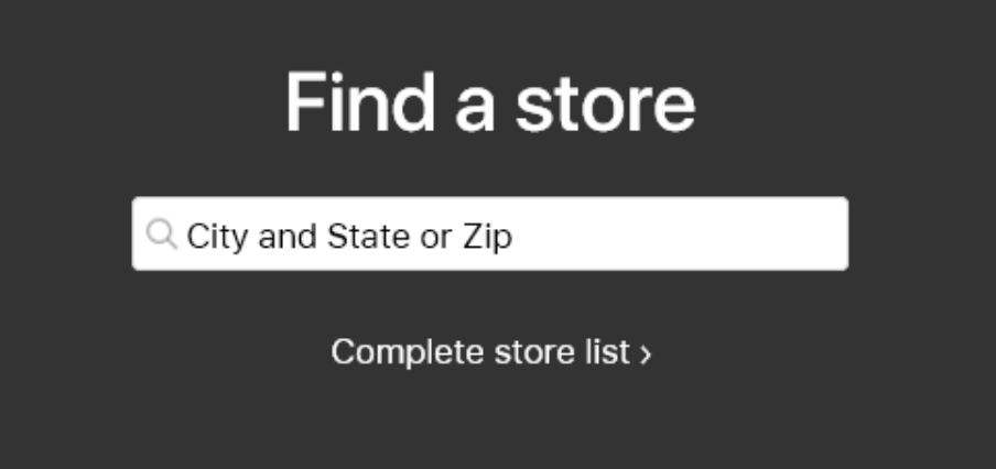
Sighted users are informed that this input field requires the City and State or Zip code (US). JAWS users will hear the placeholder text (City and State or Zip) announced if they use the JAWS form field list, or JAWS users who tab onto the input field will instead just hear 'Find a store. Edit. Required.'
This tells them that:
- The label is 'Find a store'
- It is an edit field, so they need to enter some information
- It is a required field
But it is not clear what information they need to enter. Is it a town? Postcode? County?
Whilst users may opt to guess at this point, it is straightforward to ensure that screenreader users get the same information as sighted users by entering the following code:
<input class="global-retail-search block" required="" type="search" placeholder="City and State or Zip" autocorrect="off" results="0" data-autoglobalsearch-module="retail-locator">
This uses the placeholder attribute (highlighted) to label the input field. However, the placeholder attribute should not be relied on to convey information. This article on the popular Smashing Magazine website explains why not to rely on the placeholder attribute.
This issue is easily remedied - simply use the aria-label attribute, as below, to duplicate the placeholder text for sighted users in the process.
<input class="global-retail-search block" required="" type="search" placeholder="City and State or Zip" aria-label="City and State or Zip"autocorrect="off" results="0" data-autoglobalsearch-module="retail-locator">
Alternatively, the more traditional HTML <label> element could be used to provide a hidden label, announced for screenreader users.
Accessing Apple store information online
Let's assume the user tries to enter a city name (not an unreasonable assumption) to see what happens.
Entering some characters into the search field displays the following auto-suggest results:
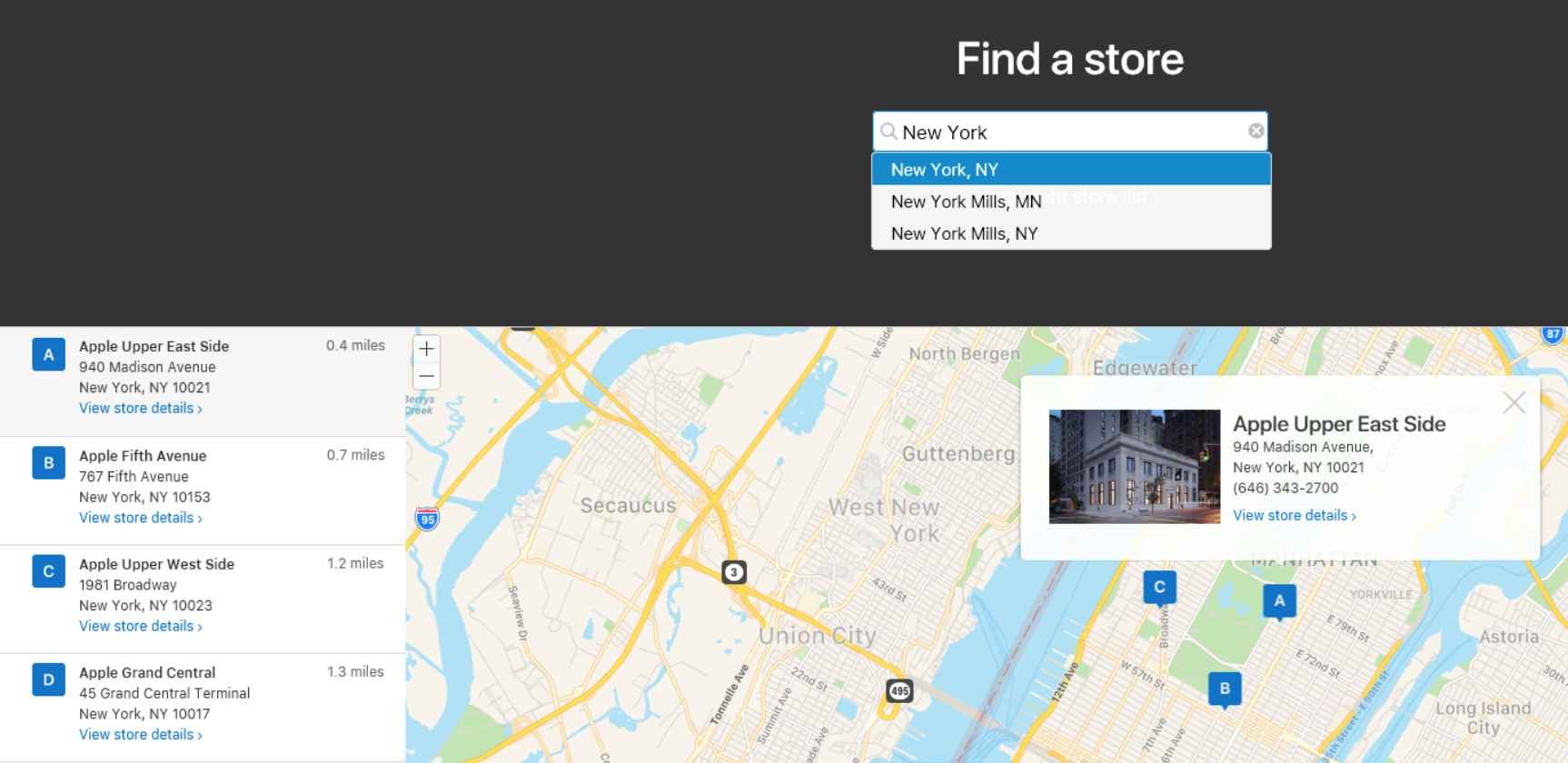
While these are easily visible below the search input field, screenreader users are not informed of these results. In addition, pressing enter has no effect except to set the focus back to the top of the page. This means that screenreader users will need to manually navigate to the search results in the bottom half of the screen – they are still not made aware of these results however, so would need to manually explore.
Once they reach the results, further challenges are presented. Each of the store location results has identical 'View store details' links:
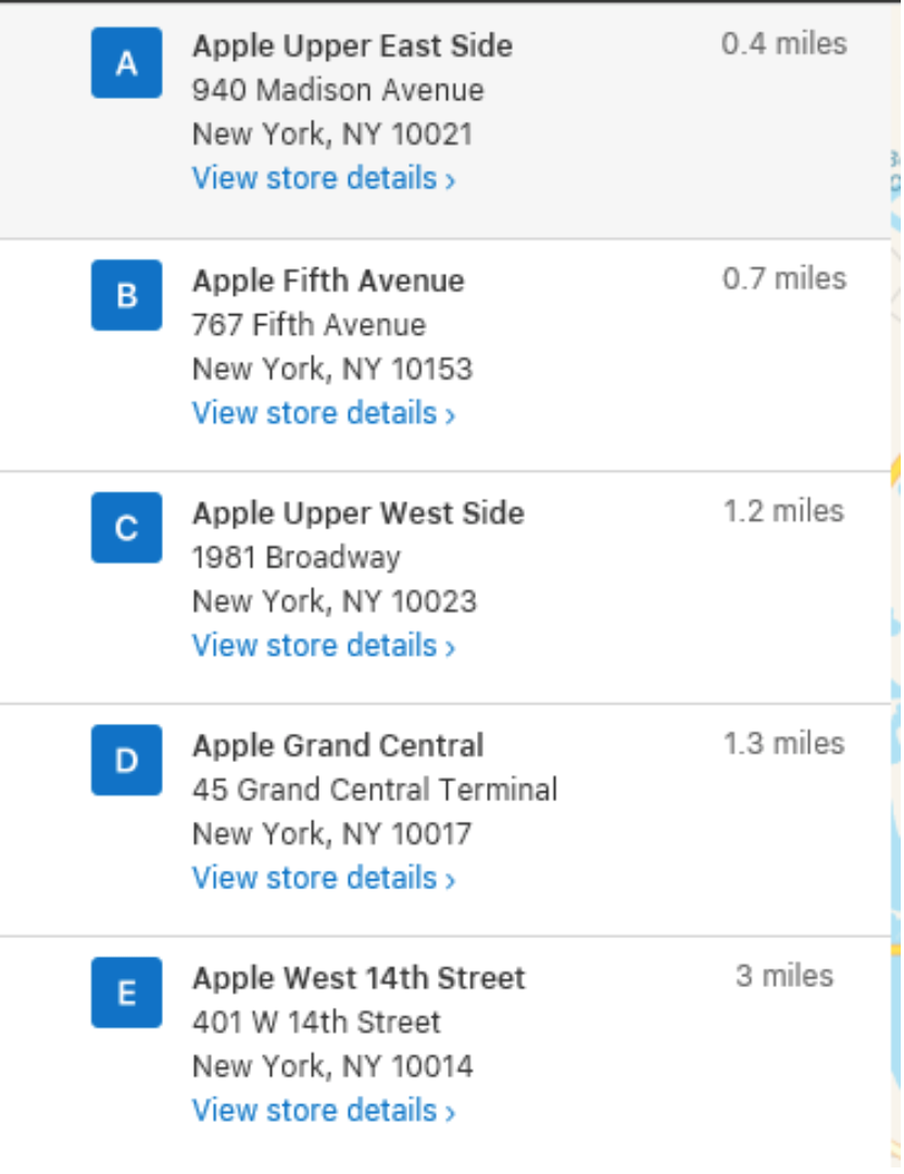
These are all announced as 'View store details' - there is no easy way for screenreader users to distinguish them. On the homepage, Apple uses hidden text to distinguish otherwise similar links e.g. 'Find out more', or 'Buy now'. This is not the case here. When reading through the links on the page, a screenreader hears the following:
Note the multiple 'View store details' links.
However, each of the stores is prefixed with a descriptive heading, so a user can select a link and then use a shortcut to hear the preceding heading announced. This would tell them that the first link to 'View store details' is about 'Apple Upper East Side'.
As there is already a technique in place elsewhere on the website for augmenting links with descriptive hidden text, it would not be difficult to replicate this here such that the links were announced as 'View store details: Apple Upper East Side' for example.
Viewing store details
Selecting a link to view the store details leads to a further page with store information:
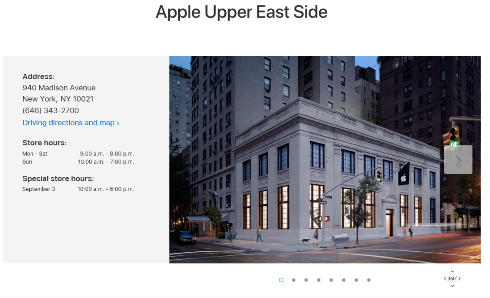
It was relatively straightforward to read the store information here. The address and store hours were announced as expected by the JAWS screenreader.
Browsing and buying products
When looking to buy products from the online store, some specific difficulties were encountered. For example, when following the flow to purchase the iPhone X, the flow consists of multiple steps, at each step making a choice such as model, carrier, finish.
These steps are dynamic – as soon as a user chooses the option for step 1, they are taken to step 2 without warning. This is a failure of the WCAG 2.0 success criteria on input. Users inputting data (e.g. making a selection via a form control) should not experience a change in context e.g. being taken to a new page, or step, without warning.
However, otherwise this flow works reasonably well - the user is told when they land on a new step, and can proceed as expected. The dynamic nature may cause difficulties for some users however, especially as the method for returning to the previous step is not clearly explained – vital in case a user selects an option by mistake. A preferred solution is to let the users make their choice – colour, carrier, capacity etc – and then select a button to confirm their choice before they are taken to a new page.
There was one interesting issue related to the final step of selecting the capacity of the iPhone being purchased:

These buttons are marked up as radio buttons. However, the labels are not usefully announced. Sighted users can see the superscript 2, but this is not distinguished as such by JAWS users, who hear this announced as "64GB 2$49.91/mo" and it is further not clear that this 2 relates to a footnote which gives further information about the available capacity on the selected model.
Mo is also not explained adequately. It would be better to use 'Month' in full to avoid ambiguity.
Summary
There were no issues here which completely prevented reaching the final stage of buying an iPhone, but there were a number of challenges with the flow that will cause some users difficulties such as
- Dynamic progression through shopping process
- Unclear method for returning to previous steps
- Insufficiently labelled radio buttons
The fixes described above provide an expert view of the way to address these issues to deliver a more inclusive user experience.
For more on making your website accessible, click here.
Joe Chidzik is the Principle Accessibility Consultant at AbilityNet