Guest blog: How to check your brand's colour contrast for accessibility
Annie Mannion | 12 Dec 2019 With more than two million people in the UK living with a visual impairment and many more having difficulties with their sight, it is crucial that, when we create content, we make accessible colour choices.
In this post Matthew Deeprose, Virtual Learning Environment (VLE) Manager at the University of Southampton shares a method he is using both to ensure colour choices are accessible and inline with an institutional brand.
Recent innovations have been shared for designing colour palettes with accessibility in mind, but what should you do if you create web-based content but your institutional or business branding was not necessarily designed with accessible colour contrasts in mind?
One of the simplest ways to ensure colour choices are accessible is to review the contrast between two colours, for example the colour of text and the background colour on which the text is placed. The higher the level of contrast the more accessible the text will be.
Web Content Accessibility Guidelines and colour
The Web Content Accessibility Guidelines (WCAG) have several recommendations regarding the use of colour to present information. Regulations such as The Public Sector Bodies (Websites and Mobile Applications) (No. 2) Accessibility Regulations 2018 in the UK use such criteria to define standards that certain organisations should follow to make their websites accessible.
At the University of Southampton, we recently refreshed the interface of our Virtual Learning Environment. Part of this work was ensuring all aspects used our institutional colour scheme. We were mindful of the need to comply with the WCAG recommendations for using colour.
These can be summarised as:
- Not using colour as the only way to convey meaning.
- Ensuring that user interface components (e.g. icons) have enough contrast between the colours used.
- Ensuring when text is presented, that the foreground and background have enough contrast.
How do we know our colours choices have enough contrast?
We used one of the many online colour contrast checkers to ensure that when we chose colours from our institutional brand palette that they were accessible according to WCAG guidelines. This can become time consuming especially when you have a lot of colours to choose from.
A useful approach?
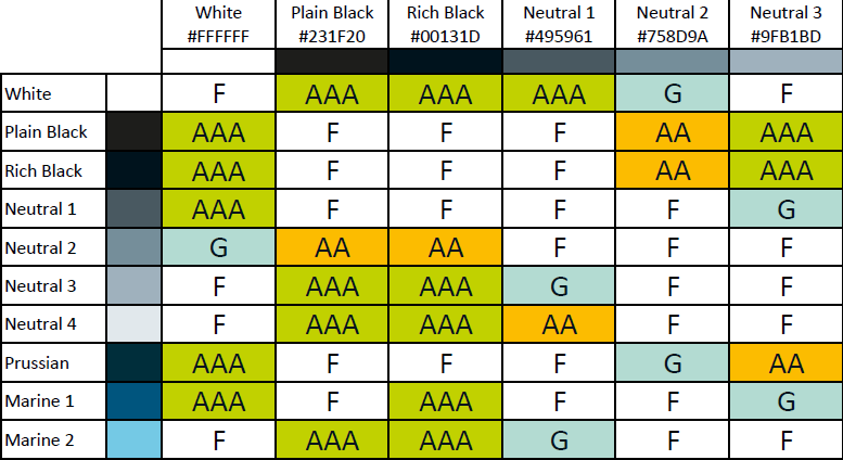 To save time, I created a chart that showed all the possible colour combinations of our institutional brand and whether they would be WCAG compliant when used together. Rather than looking up 441 possible combinations myself, I wrote a script to query the WebAIM Colour Checker API and produce a results table automatically.
In the matrix shown here, F means the combination should only be used for decorative purposes, not to convey any meaning. G means that colour combination has a colour ratio above 3:1 and is suitable for user interface elements such as icons that do not contain text. AA means the ratio is above 4.5:1 and is the minimum suitable for text. AAA means the ratio is above 7:1 and meets the enhanced level.
Using the matrix makes identifying colour combinations that are accessible and “on brand” much faster than using an online colour checker. It encourages discussion with colleagues and demonstrates that making accessible colour choices need not be difficult.
Feedback and the future
Since sharing this with the JISC Digital Accessibility mailing list, other institutions have shown they are taking a similar approach. I particularly like this example from the University of Sussex.
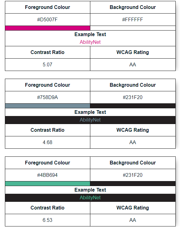 Discussing the matrix with colleagues it became clear that being able to show what accessible colour options were available is also important to help people to visually choose an accessible colour combination that suits their purpose. I developed my script further to produce examples of each accessible combination.
Download the Brand Palette Accessibility Matrix PDF
As institutions and businesses create new colour palettes, they should be designed to allow the highest number of accessible combinations and such a matrix would not then be necessary.
I am developing my process further and hope to be able to assist other institutions who would like to create a similar accessibility matrix.
About Matthew Deeprose
Matthew Deeprose is the VLE Manager at the University of Southampton. He has 20 years' experience of managing elearning platforms and supporting staff with their use. Matthew is championing the understanding of and compliance with The Public Sector Bodies (Websites and Mobile Applications) (No. 2) Accessibility Regulations at the University of Southampton. He is always interested to meet and connect with others. You can contact Matthew via his LinkedIn profile.
Further reading
Specific to use of colour:
- Whocanuse will not only explain the contrast of two colours, it will tell you what proportion of the population would have difficulty viewing materials in those colours.
- Read Deque University's clear explanations and descriptions of colour contrast.
General
- An easy to read overview of making resources accessible.
- Bruce Lawson’s great overview of how to avoid common accessibility issues.
- A useful one-page Accessibility “cheat sheet” produced by Moritz Geissmann.
Plugins
- Accessibility Insights is a great plugin for browsers that reveals accessibility failures, including colour contrast issues.