5 top tips for making nature and your websites more accessible
Robin Christopherson | 26 Apr 2023As the weather gets warmer and summer is on the horizon, getting outside and into nature is an absolute joy. For many, the first step to hitting the great outdoors might be doing some research about the area you plan to explore, and, for many disabled people who may have specific requirements, there can be barriers imposed to accessing this information online.
In this blog, AbilityNet’s Head of Digital Inclusion Robin Christopherson, MBE outlines some straightforward steps to making websites more accessible.
Accessing the outdoors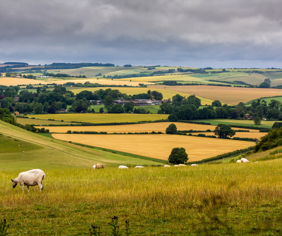
Being blind, when we’re out and about in the great outdoors, I rely on a verbal description provided by a companion in order to gain some appreciation of nature’s stunning visuals. In the same way, I also rely on the accessibility of websites to ensure that I’m able to understand and use them.
When planning to head out into the natural world, I want to be able to easily access information on the destination, and if planning on heading there myself, how I may be accommodated as a disabled visitor. If accessibility has not been factored into the creation of the website, it can make accessing nature all the more difficult.
Accessible websites don’t just benefit blind users, but all people across the broad and beautiful spectrum of disabilities and impairments. So by making adjustments, you’ll be making your apps and websites extra usable for everyone - and you’ll meet your legal obligations under the Equality Act 2010.
How to make your websites inclusive
Here’s five simple, straightforward steps to help you make your website more accessible.
- Check the keyboard accessibility of your site
People with little vision rely on keyboard access as they cannot easily see the mouse cursor on the screen. Sighted users with motor difficulties (such as Parkinson’s or a stroke) can find keyboard access simpler as well. Making your site accessible without using a mouse is a legal requirement, and something that will benefit many of your visitors.Hiding your mouse and trying to access your site and all its options with only a keyboard can show how you're doing and how to improve this. In particular, make sure that each link and button gains a nice, visible focus as you tab through the page, and that that tabbing order is logical and doesn’t jump all over the place (making it difficult to follow). If you want to ‘click’ something with focus, that’s Enter or the spacebar.
- Ditch poor colour contract
Low contrast text is difficult to read for everyone, particularly people with low vision. There are some useful tools that can help you check your contrast such as Tanaguru's Contrast Finder, this allows you to enter two different colours and check the contrast between them. It can also suggest alternatives if the colours have insufficient contrast.Tools like the Contrast Analyser from the Paciello Group can also help pick the right colours.
Hint: Trust your eyes too - it can be simple to spot offending text colours by eye, and then just verify them with the tool. This is best used early in the design process, so that issues can be addressed before the site goes live.
- Use a free accessibility checker
The organisation WebAIM (Web Accessibility In Mind) provides a free, automated, online checker. This can give you quick feedback on some more technical issues on your website – e.g. if forms are correctly labelled so a blind person knows what info they need to enter. This is a great way to highlight issues during the development process.It’s important to note that any automated testing can only cover a small subset of all possible accessibility issues. However it is a valuable technique when used alongside manual testing.
- Produce an accessibility page
An Accessibility page provides the opportunity for organisations to inform visitors on what measures they have taken to make their site accessible. The page can offer people the chance to provide feedback on difficulties they experience when navigating your site. See AbilityNet's accessibility page for an example.Getting feedback from people visiting your site is very valuable. By making it easier for users to feedback to you directly, you will benefit greatly by both demonstrating your commitment to improving your site, and being able to respond to individual issues as they aris
- Understand your audience and what they need from your site
Knowing your expected audience and writing your copy accordingly will provide the most useful and inclusive experience to your site’s visitors. People come to websites to find information, or to carry out an action. It makes sense to make this process as easy as possible for people.Using eco-jargon, say, may be fine for visitors with that background, but lay visitors may miss out. Good practise is to avoid jargon, or if it is necessary, provide a glossary.
Make use of headings, paragraphs and bulleted lists to break text up into meaningful sections. Make one key point per paragraph and use different methods to convey information. Some users will prefer to read text (like me), others will benefit from a video, others prefer a simplified or illustrated guide.