The easiest solution to website inaccessibility
dafydd.henke-reed | 24 Dec 2018We audit a lot of inaccessible websites. Many are created by FTSE 100 companies that are committed to accessibility. This begs the question: why are the websites inaccessible?
Web standards provide the means for creating high-functioning, accessible websites. Not everything can be made accessible from standards-conformant HTML. Multimedia can be particularly challenging. Audio descriptions and captions require consideration. Nonetheless, well-structured, semantic HTML affords considerable accessibility.
For example, the best way to ensure that a link is accessible is simply to use a native anchor tag. Consider what is required for a native and custom link to be broadly accessibile. This is a native link:
- Wrap the element in an anchor tag
- Give it a valid href attribute
- Ensure that it has a textual content
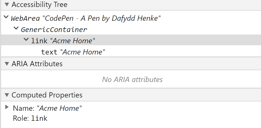
Native link example:
<a href=”http://www.acme.com”>Acme Home</a>
The alternative is much more complex. This is a custom link:
- Wrap the element within a container
- Add the element to the focus order
- Define the element as a link
- Use device-independent event handlers
- Create a JavaScript function that loads a URL on request
- Create a CSS class that styles the element as a link
- Create a CSS class that provides focus indication
- Ensure that it has a textual content
Custom link example:
<span class=”link” tabindex="0" role="link" onclick="goToLink(event, ‘http://www.acme.com')" onkeydown="goToLink(event, 'http://www.acme.com’)">Acme Home</span>
The above can contribute a similar node on an accessibility tree. This is a behind-the-scene document that assistive technologies use to interface with websites. It catalogues properies such roles (e.g. link) and names (e.g. acme home). These can then be parsed by assistive technologies such as screen readers.
The work required is widely different, however. The custom solution also adds dependencies. It relies upon custom-made CSS and JavaScript. It requires more dev time, degrades less gracefully, and is more likely to break.
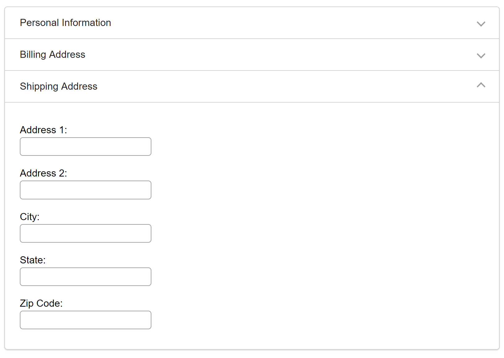
So why make development harder? It is the result of content creep. Simply put, organisations want too much on their websites. It is common to have accordions, tab panels, and modal dialogs on a single page. But all these do is inelegantly side-load content.
An accordion toggles the visibility of content. It is not available in the HTML specification. All it does is hide content that, if displayed by default, would clutter the page. At the same time, it can drastically hamper accessibility.
Ample effort is dedicated to fixing inaccessibility. However, it is slow-going to fix problems created by content-bloat. It is considerably more effective to champion accessible practices throughout development. The result is slimline, well-curated and performant websites.
The alternative is embedding complexity that engenders inaccessibility and user disengagement. User testing at AbilityNet indicates that users avoid anything complicated when simpler options are available.
This includes date pickers. It is easier for users to enter this sort of information manually. Give them a standard input field and they can complete the task in milliseconds. That will never be true of a date picker. Users wade through years, months, and days. The design pattern looks more visually fit-for-purpose. But it is functionally much more complex.
The same is true with content in general. The more content on a website, the more difficult it is to use. Consider screen magnification users. Zooming into a page that is bloated with content can be extremely disorientating. A client might ask: “How can we make blocks of text easier to perceive for screen magnification users?”. The answer is: “Have less of it.”
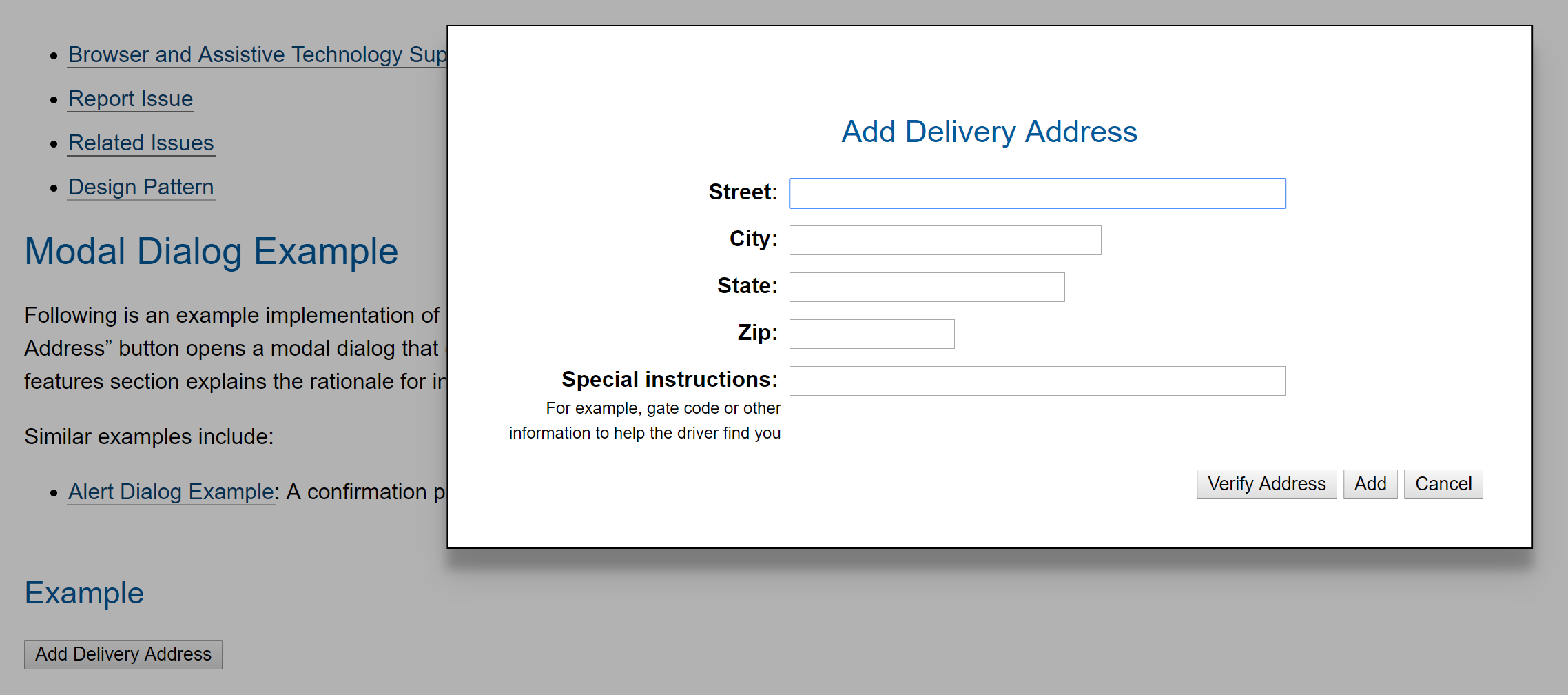
What makes matters worse is that complexity can require breaking the rules of accessibility. A cornerstone of keyboard accessibility is to never trap focus. Allow users to keyboard tab through everything. However, modal dialogs necessitate trapping focus whilst they are active. It would be confusing to tab behind one of them and onto background elements. Best practice for a complex pattern is to ignore best practice.
We often see developers attempting to remedy this with ARIA (Accessible Rich Internet Application). This is code that can be added to boost the accessibility of patterns that cannot be made with semantic HTML.
However, as WebAIM states: Almost every report we write includes a section cautioning against ARIA abuse and outlining ARIA uses that need to be corrected or, most often, removed. Ironically, this is often followed by a list of issues that can only be addressed with ARIA.
- John Whitling, WebAIM - To ARIA!
The more we allow content bloat and retrofitted ARIA, the harder it becomes to create robust and sustainable websites. A hack used to visually declutter a page can be broken by a single browser update. Of course, small updates will always be required. No solution works forever. However, the issues that we identify at AbilityNet are symptomatic of fragile websites, bloated, and committee-designed websites.
Inaccessibility is caused by a desire to add more content. The easiest way to create accessible websites is to say no. Create lean designs and stick to them. Cut your copy in half. Then, cut it in half again.
Be elegant. Your accessibility will skyrocket.